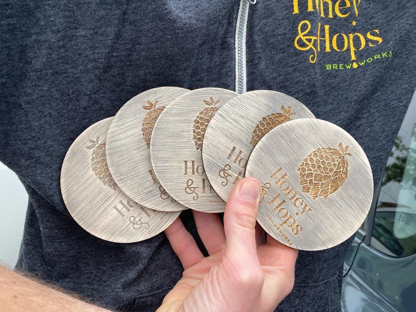
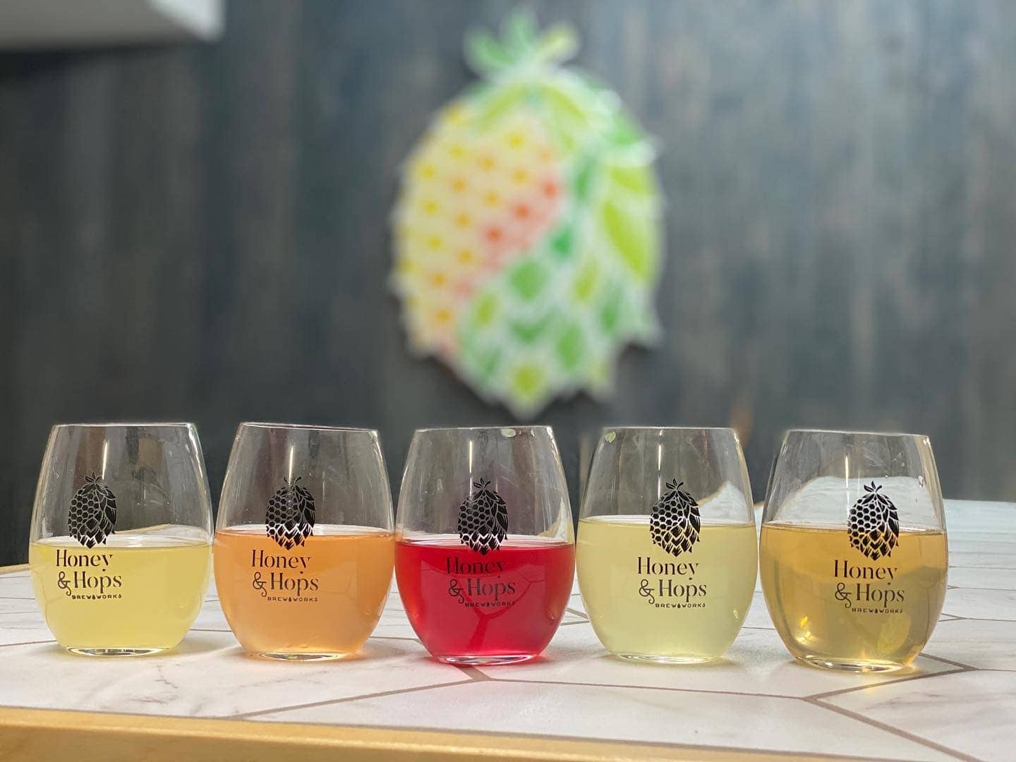
After collaborating, we brought to life their vision of a logo that captured the complementary forces of honey and hops. Each flavor of Honey & Hops has its own background story and gets its own graphic. From “Crandemic” to “Scenic Drive” the logo needed to be able to pair well with different graphics. It also needed to look good on schwag ranging from engraved coasters to embroidered hats. The result is a well-received and easily recognizable logo for an award winning mead.
Logo / Illustration / Packaging / Ads


“Working with Erica is always a breeze. I’ve worked with her on several projects over the years, and the most recent time was no exception. She took our vision and transformed it into a logo we get compliments on daily! Cheers!”