If you work on the web at all — whether in design, development, digital marketing, email marketing, or content creation — you’re working with images. It’s unavoidable. And if you’ve been doing it long enough, you’ve learned (sometimes the hard way) that unoptimized images are one of the fastest ways to slow down a site, tank an email’s deliverability, or frustrate an audience before they’ve even read a word.
Experienced practitioners know that image optimization is key to the quick delivery of assets, whether they’re landing on a web page or inside an inbox. But optimization is a delicate balance — it depends on the tool doing the outputting, the knowledge of the person behind it, and the specific context the image is headed into. Get it right and your content loads fast and looks sharp. Get it wrong and you’re either shipping bloated files that punish your users, or you’ve compressed so aggressively that your images look like they were photographed through a foggy window. As they say, image is everything.
Who This Is For
This isn’t a guide for engineers. It’s for everyone else who touches images in the course of doing their job — and doesn’t have a technical sherpa to call when things go sideways.
- Social media managers resizing event photos for Instagram, LinkedIn, and Facebook on the same afternoon — and wondering why the same image looks crisp on one platform and muddy on another.
- Email marketing coordinators dropping a 4MB PNG into a Mailchimp or Constant Contact campaign and getting a warning they don’t fully understand, while wondering if it’ll affect whether their newsletter actually reaches the inbox.
- Nonprofit communications staff who update their organization’s WordPress site between other responsibilities, uploading whatever the photographer sent over because nobody told them there was a better way.
- Event coordinators who walk away from an event with 300 photos from a hired photographer and need to get a representative selection onto the website and into a post-event email blast — fast.
- Front-of-house managers and restaurant staff tasked with keeping a Squarespace or Wix site current with seasonal menus, new photos, and promotions, without a designer in the loop.
- Development and fundraising professionals producing donor communications, digital annual reports, and email appeals where heavy images can trigger spam filters or cause the email to clip before the ask.
If any of those descriptions made you nod, this guide is for you. The tools and workflow covered here are practical, mostly free, and don’t require Photoshop or a computer science degree to use.
Format First, Then File Size
File size tends to get all the attention, but format is really where the conversation starts — because format determines how much you can compress an image before it starts to fall apart.
JPEG (JPG) is your workhorse for photographs and complex images with lots of color gradients. It uses lossy compression, meaning it discards some data to achieve smaller file sizes. The trick is finding the sweet spot — somewhere in the 70–85% quality range is often indistinguishable from 100% to the human eye, but at a fraction of the file size.
PNG is best for graphics, logos, illustrations, and anything that requires crisp edges or transparency. It uses lossless compression, which means it retains all image data — and that’s precisely why PNG files tend to run larger. The biggest culprit? Alpha channels. When a PNG includes transparency, the file stores an additional channel of data (the “alpha” channel) for every single pixel in the image, defining how opaque or transparent each one is. This can add significant overhead to the file size, especially on large images. If transparency isn’t required for your use case, always reach for a JPG instead.
GIF is largely a legacy format at this point, best suited for simple animations. For static images it’s almost always the wrong choice — the 256-color limit produces noticeably degraded results compared to JPEG or PNG.
WebP is worth mentioning here too. It’s a modern format that offers both lossy and lossless compression, typically outperforming both JPEG and PNG on file size while maintaining comparable quality. Browser support is excellent at this point, so if your CMS or workflow supports it, WebP is increasingly the smart default.
Don’t Assume Your Platform Is Handling This For You
One of the most common misconceptions in web publishing — and email marketing — is that uploading an image to your platform is the same as optimizing it. It isn’t. And the gap between those two things depends significantly on which platform you’re building on.
WordPress
A quick but important distinction before we get into it: there are two very different things that share the WordPress name. WordPress.com is a hosted website service with its own plans and limitations. WordPress.org is the open-source software that powers self-hosted websites — the kind PRÜF builds and maintains for clients. Everything below applies to self-hosted WordPress (affliate link), which is what most agencies, nonprofits, and serious small business sites are running. If you need help interpreting that further, or migrating hosts, PRÜF can absolutely help you navigate hosting.

WordPress is the most widely used CMS in the world, and its handling of images is capable but incomplete. When you upload an image, WordPress will automatically generate several resized versions — thumbnail, medium, large, and full — based on your media settings or what your theme defines. That’s genuinely useful for responsive layouts. But resizing is not the same as optimization. WordPress does not automatically compress images, strip unnecessary metadata, or transcode them to more efficient formats like WebP. What you upload is, largely, what gets served.
To get proper compression and transcoding in WordPress, you need a plugin. If you’ve already been using TinyPNG or TinyJPG as part of your workflow, the most natural fit is the official TinyPNG plugin for WordPress, built and maintained by the same team behind the tools covered in this article. It uses the same Tinify compression engine, so the quality and behavior you’re already familiar with carries directly over. On upload, it automatically compresses your images and can convert them to WebP or AVIF. It also includes a bulk optimization tool — Media > Bulk TinyPNG — that lets you run your entire existing media library through the Tinify engine in one pass. The free tier gives you 500 credits per month, same as the API; because WordPress generates multiple thumbnail sizes per upload, that works out to roughly 50–100 images per month depending on your theme’s size settings. The same API key works across both the plugin and the Raycast workflow described later in this article, so your monthly credits are shared between them.

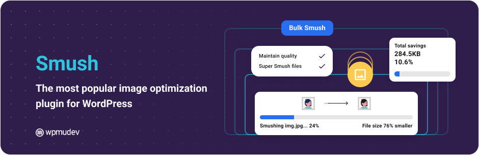
Two other widely used options worth knowing about are Smush and ShortPixel’s Smart Image Optimizer. Both handle compression and WebP conversion on upload and include bulk optimization for existing libraries. ShortPixel in particular supports multiple compression modes — lossy, glossy, and lossless — and also offers AVIF conversion. All three plugins have free tiers with monthly limits, and all three have paid plans if you’re running a content-heavy site and hitting those ceilings regularly.
The bottom line for WordPress users: thumbnails are handled out of the box, everything else is your responsibility unless you’ve specifically addressed it — and a compression plugin is one of the more straightforward gaps to close.
Webflow
Webflow occupies an interesting middle ground. On the designer side, it gives you more granular control than most platforms — and on the optimization side, it offers more built-in tooling than WordPress does out of the box, but it still requires deliberate action rather than running automatically.
Webflow automatically generates responsive image variants when you upload assets, ensuring appropriately sized images are served across device types, and it supports lazy loading by default for images below the fold. Where it gets more hands-on is format conversion: Webflow has a built-in image conversion tool in the Assets panel that lets you convert existing JPEG and PNG files to WebP or AVIF directly within the interface. You select the assets, trigger the compression, and republish. It’s a meaningful capability — but it’s a manual step, not an automatic one. Images uploaded to Webflow are not silently transcoded on your behalf; you have to initiate it.


There’s also an important caveat with CMS-driven content: Webflow’s conversion tool doesn’t automatically process images that come in through CMS Collection fields. If you’re running a blog or content-heavy site in Webflow and contributors are regularly uploading images, those images won’t be automatically optimized the way static design assets might be. For that gap, third-party tools like Optily exist to handle CMS image optimization — though they come at an additional cost.
One more thing worth knowing: when converting assets in Webflow, the original file is replaced by the WebP or AVIF version. There’s no going back unless you’ve kept a backup or can restore from a prior site snapshot. Always keep your source files.
Wix
Wix takes the most hands-off approach for site owners — and that’s by design. When you upload an image to Wix, the platform handles compression automatically in the background, serves responsive versions based on device type and screen resolution, and converts images to WebP where the visitor’s browser supports it. Wix also implements lazy loading by default, so images below the fold don’t load until the user scrolls toward them. None of this requires configuration on your part.

That’s a meaningful advantage for non-technical users who don’t want to think about this layer of the stack. The trade-off is that you have less control. Wix’s automatic optimization works for most cases, but you can’t tune it, override it, or audit what’s actually being served without digging into browser developer tools.
Squarespace
Squarespace sits somewhere between WordPress and Wix. It applies responsive image scaling automatically — uploading a large image and having it served appropriately on mobile is largely handled for you. Squarespace recommends keeping uploaded images between 1500 and 2500 pixels wide to ensure they scale well across devices, and it handles basic compression on its end. However, like WordPress, it doesn’t do deep transcoding out of the box. If you want more aggressive optimization on a Squarespace site, there’s a first-party extension called TinyIMG — the same technology as TinyPNG/TinyJPG, adapted for the platform — that can handle image compression and SEO optimization for filenames and alt text.


One note worth making regardless of platform: Squarespace requires images to be in the RGB color space for proper web display, not CMYK — which is the color profile used for print. If you’re pulling images from a print production workflow and uploading them directly to the web, this is a conversion you need to make before uploading. Most export tools handle this automatically if you tell them to, but it’s worth knowing it exists.
Shopify
Shopify is the strongest out-of-the-box performer on this list when it comes to automatic image handling — which makes sense given that fast-loading product pages are directly tied to conversion rates and revenue. When you upload an image, Shopify automatically compresses it, generates responsive variants for different screen sizes, and serves it through a global CDN. Crucially, Shopify also automatically detects the visitor’s browser and delivers the most efficient supported format — WebP or AVIF for modern browsers, with JPEG fallback for older ones. Even GIFs get converted to animated WebP automatically. This all happens without any action on your part.


That said, “automatic” doesn’t mean “perfect.” Shopify’s compression is tuned as a reasonable general-purpose baseline, not an aggressive optimization. If you’re running a store with a large catalog and performance is a serious priority, you’ll still benefit from pre-optimizing images before upload — the platform is best understood as a solid floor, not a ceiling. For stores that want to go further, apps like TinyIMG are available in the Shopify App Store and integrate directly with your catalog.
One note for developers: Shopify’s automatic optimization only applies when themes are using the image_url and image_tag Liquid filters. If you’re working on a custom or older theme that doesn’t use those filters, the automatic optimization pipeline may not engage. Keeping themes current is one of those unglamorous maintenance tasks that quietly affects performance.
Mailchimp
Email platforms are a different beast from website CMSs, and image optimization matters here just as much — arguably more, because a bloated email can slow to render, get clipped by Gmail’s 102KB message size limit, or trigger spam filters before your audience even sees it.
Mailchimp will automatically resize images to fit the content block they’re placed in, and it will warn you if an uploaded image is significantly oversized. That’s useful guardrails, but it’s not optimization. Mailchimp does not compress images in any meaningful way on upload, and it doesn’t transcode them to more efficient formats. What you put in is largely what goes out to your subscribers’ inboxes. The platform recommends keeping images under 1MB for reliable upload and display performance, and images should always be in RGB color mode — not CMYK, which is for print and will render incorrectly on screens. For retina display compatibility, Mailchimp suggests uploading at double the display width, so a 600px-wide email content block ideally receives a 1200px source image. All of that prep work is on you before you hit upload.
Constant Contact
Constant Contact‘s image handling is even more hands-off than Mailchimp’s — and not in a good way. The platform enforces a 5MB upload limit and will apply its own compression to images that exceed 800px in width, but that automatic compression is lossy and unsophisticated, and it can produce visibly degraded results — grainy, fuzzy images that undermine the professionalism of your email. Their own community support documentation is candid about this: if a recipient’s connection can’t handle your image sizes, that’s largely outside what Constant Contact can control.
The practical implication is that with Constant Contact in particular, the responsibility for optimization falls entirely on the sender before anything is uploaded. Aim for images no wider than 600–650px for full-width placements, keep file sizes well under 1MB (under 200KB is a reasonable target for most email images), and always pre-compress before uploading. The workflow in this article was practically built for this situation.
The Takeaway
The more control a platform gives you, the more responsibility lands on you. Wix and Shopify largely take care of image delivery so you don’t have to think about it. WordPress gives you full flexibility but assumes you’ll fill the gaps yourself — which most sites don’t, at least not by default. Webflow and Squarespace fall in between, offering meaningful built-in tools that still require intentional use. And on the email side, both Mailchimp and Constant Contact essentially put the optimization burden squarely on the sender — the platforms do minimal processing and expect you to show up with properly prepared files.
Wherever you’re publishing, the workflow in this article applies to your source files before they ever hit your platform. Optimizing at the source means you’re not relying on your CMS or email tool to fix what you’ve uploaded — you’re starting from a solid baseline regardless of where the image ends up.
Not Everyone Has Photoshop — And That’s Fine
Adobe Photoshop remains the gold standard for image editing and export control, but it’s expensive, has a steep learning curve, and is overkill for most day-to-day image tasks. On a Mac, Preview fills in some of the gaps — you can adjust size, export to different formats, and do basic edits — but it’s limited in what it offers for optimization control. Canva is excellent for spinning up quick graphics and keeping a design system accessible to contributors with varying skill sets, but it’s a design tool, not an image editor. And across all of these tools, most users don’t have a reliable sense of what the “right” export settings actually are — because the answer genuinely varies from image to image.
So let’s talk about a workflow that takes the guesswork out of it.
Step 1: Export at the Highest Reasonable Quality
Before you optimize, you want to start with a solid source file. The general rule: export at the highest quality your use case warrants, then let your compression tool do the heavy lifting.
For photographs and rich graphics headed to the web, export as a JPG. Most tools default to somewhere around 60–70% quality, which is often fine, but if you’re unsure, err on the side of higher quality (85–100%) and compress it afterward — you’ll get better results than starting from a degraded source.
For logos, icons, UI graphics, or anything with transparency, export as a PNG. Accept the larger file size at export — again, you’ll compress it in the next step.
For anything animated, GIF is still the pragmatic choice for broad compatibility, though video formats like MP4 are increasingly preferred for web use given their dramatically smaller file sizes.
Step 2: Get a Free TinyJPG Account and API Key
TinyJPG — also known as TinyPNG, since it handles both formats — is one of the best image compression tools available. It uses smart lossy compression techniques to reduce file sizes by 50–80% with minimal perceptible quality loss. The free web interface lets you drag and drop up to 20 images at a time, but the real power unlocks when you grab an API key.
Here’s how to get one:
- Head to tinypng.com/developers
- Enter your name and email address to register for a free API key
- Check your inbox and click the confirmation link
- You’ll be taken to your developer dashboard where your API key is waiting
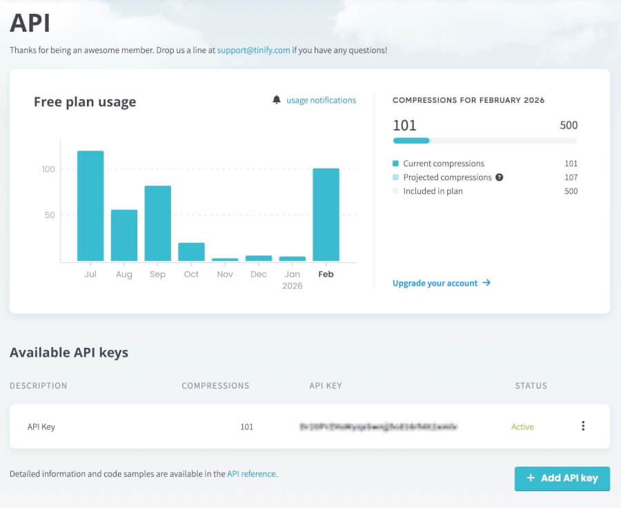
The free tier gives you 500 compressions per month, which is plenty for most individual contributors and small teams. From here, you can integrate this key into a variety of tools — including the one we’re about to talk about.
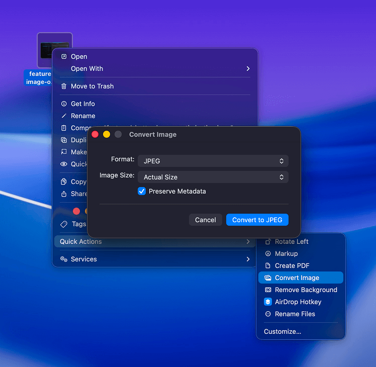
Bonus: Switching Image Formats Quickly on a Mac
Before we get to the main event, here’s a quick tip for Mac users. If you need to convert an image from one format to another without opening any additional software, right-click the file in Finder, hover over Quick Actions, and select Convert Image. You’ll get options to choose the output format (JPEG, PNG, HEIF) and adjust the image size. It’s not a compression tool, but for a quick format swap it’s hard to beat.
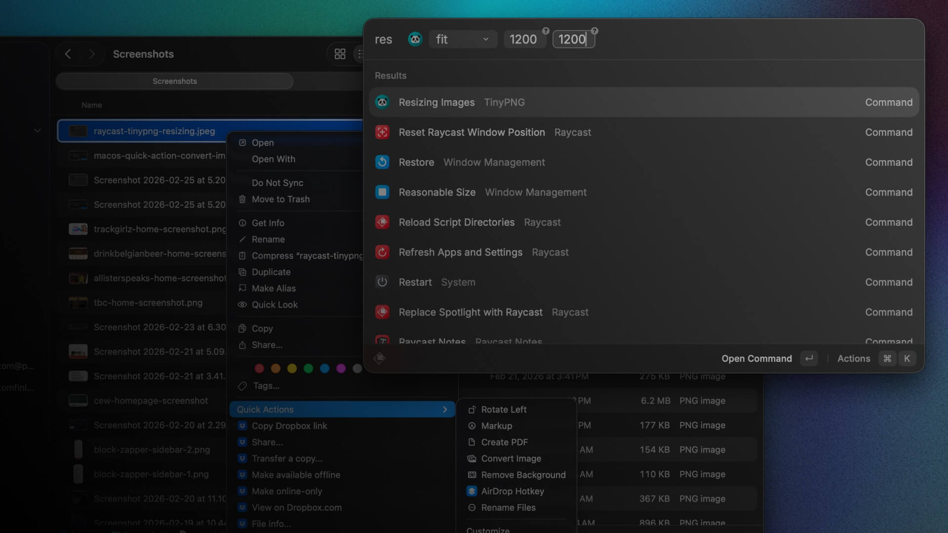
Step 3: Meet Raycast — and the TinyPNG Extension
Raycast is a productivity launcher for Mac that replaces (or supplements) Spotlight Search. If you haven’t used it, the short pitch is this: it does everything Spotlight does, plus a whole lot more, including running extensions built by the community that let you interact with third-party tools directly from the launcher. It’s free, fast, and deeply extensible.
One of those community-built extensions is the TinyPNG extension for Raycast, built by Kawamata Ryo. It lets you compress images using your TinyPNG API key without ever opening a browser.
Setting it up:
- Download and install Raycast from raycast.com if you haven’t already
- Open Raycast and navigate to the Store (search “Store” in the launcher)
- Search for TinyPNG and install the extension
- Once installed, open Raycast’s Extensions preferences and find TinyPNG in the list
- Paste your TinyPNG API key into the provided field and save
Mapping your hotkey:
By default, Raycast will prompt you to set an activation shortcut during setup. Since Command + Space is reserved for macOS’s built-in Spotlight, I’ve opted for Control + Space as my Raycast toggle — it’s close enough to feel natural and doesn’t conflict with anything. You can set this under Raycast Preferences → General → Raycast Hotkey.
Using it:
Once everything is wired up, the core workflow is simple. Select one or more image files in Finder, open Raycast with your hotkey, type “TinyPNG,” and run the compress command. Raycast uploads your images to the TinyPNG API, compresses them, and automatically downloads the results into a designated output folder of your choosing (configured in the extension settings). No browser, no manual downloading, no renaming files — just fast, silent compression right from your keyboard.
Going Further: Resize, Convert, and More
What makes the TinyPNG API genuinely powerful — and what the Raycast extension surfaces through its options — is that compression is just the starting point. The API supports resizing, format conversion, and metadata control, all in a single pass. Here’s what’s available and when you’d use each.
Resizing
Rather than compressing an image and then separately resizing it in another tool, you can handle both in one operation. The API offers four resize methods, each suited to a different situation:
Scale resizes the image proportionally based on a single dimension — either width or height, but not both. The aspect ratio is preserved automatically. This is the right choice when you know you need an image that’s exactly 800px wide but don’t care about the resulting height.
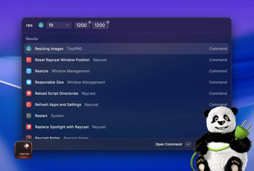
Fit scales the image proportionally so it fits within a bounding box you define by both width and height. The image won’t exceed either dimension, but it also won’t be cropped — if the aspect ratio doesn’t match your box exactly, the image will simply be smaller in one direction. Think of it like object-fit: contain in CSS. This is great for thumbnails where you want consistent maximum dimensions without any cropping.
Cover is the aggressive sibling of fit. It scales the image to fill the exact dimensions you specify, and crops whatever doesn’t fit. The clever part: TinyPNG’s algorithm automatically determines which parts of the image are least visually important and crops those away first, rather than blindly cutting from an edge. If you’ve ever used object-fit: cover in CSS, this is that — but baked into the file itself. Use this for hero images, cards, or any context where you need pixel-perfect dimensions.
Thumb takes cover a step further. It’s designed specifically for product images or any photo where the subject is a standalone object against a plain or simple background. Instead of just cropping, it detects the free-standing subject, adds breathing room where needed, and trims away genuinely unimportant background. If you’re optimizing e-commerce or portfolio images, this is worth experimenting with.
One important note: the API will not scale an image up. If your target dimensions are larger than the original, the image is returned as-is. This protects image quality and prevents you from accidentally serving pixelated, upscaled assets.
Preserving Metadata
By default, this method of using TinyPNG strips all metadata from images during compression — and most of the time, that’s exactly what you want. Metadata adds bytes, and most of it (camera settings, software tags, editing history) is irrelevant to your end user.
Putting It All Together
The full workflow in practice looks like this: design or source your image, export it at full or near-full quality in the appropriate format, optionally convert formats using Quick Actions if needed, then fire up Raycast and let TinyPNG do the compression work. What used to involve multiple apps, browser tabs, and manual file management collapses into a few keystrokes.
It’s not a complicated system — but that’s the point. The best optimization workflow is the one that actually gets used consistently, by everyone on your team, regardless of their technical depth. This one fits that bill.